You may have noticed that things have changed for the better when you log into Jobvertise. We've spent a lot of time removing the clutter and giving you better and consistent navigation throughout the site.
For example, here is the typical login page:

There is a consistent logout button at the bottom of the pages and relevant navigational links.
Checkboxes or warning signs on the left column alert you to things that are optimal or need to be done.
We also have improved dialog boxes used throughout the site which gives you a better visual representation of what occurred form the previous page. For example:
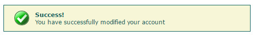

The top dialog box indicates success by the green checkbox and green outline of the box. The bottom dialog box alerts you to a problem because of the octagon which represents a stop sign, an "X", and a red outline of the box.
These visual cues alert you to what is going on in multiple ways in addition to text message.
Please enjoy your new employer account area and let us know if there is something we can do better!
The Jobvertise Team